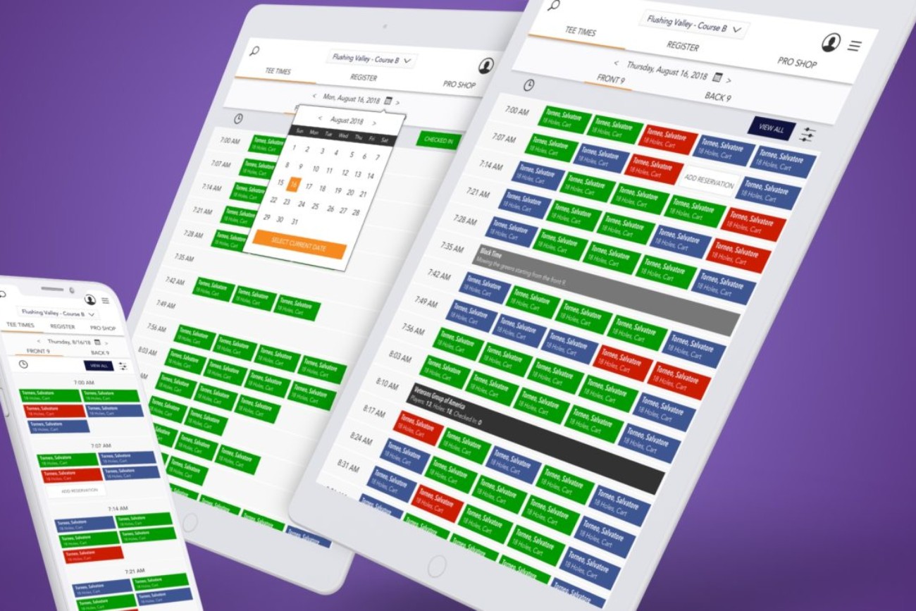
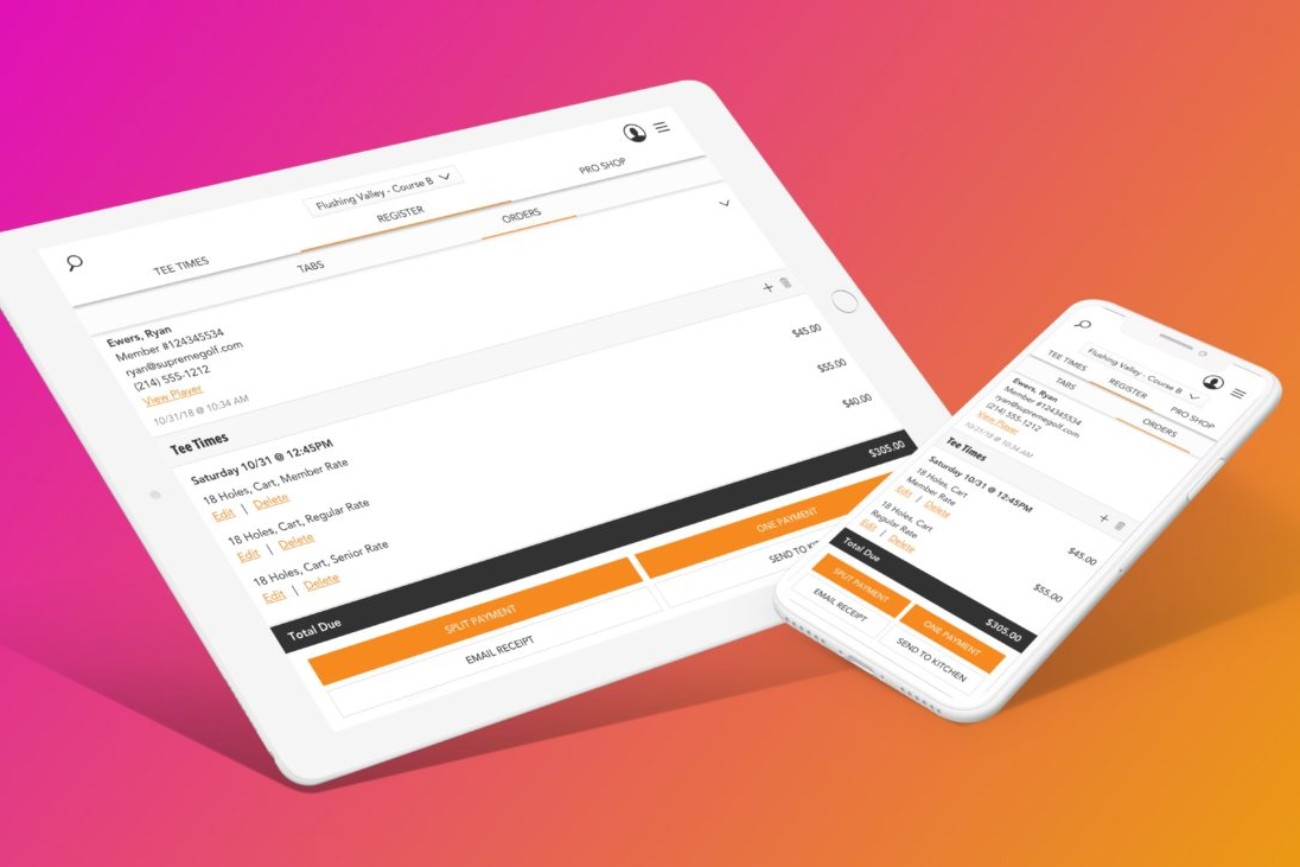
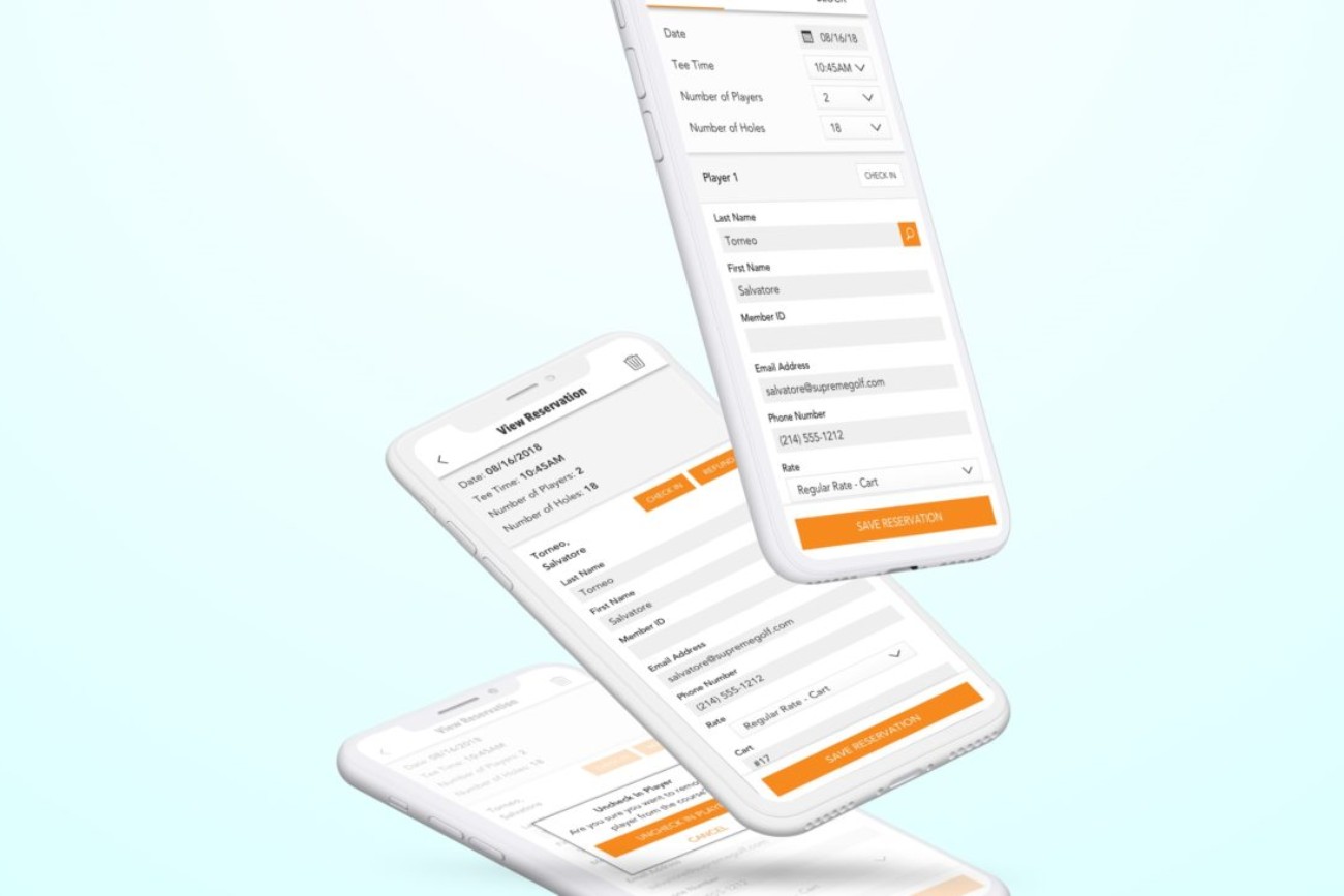
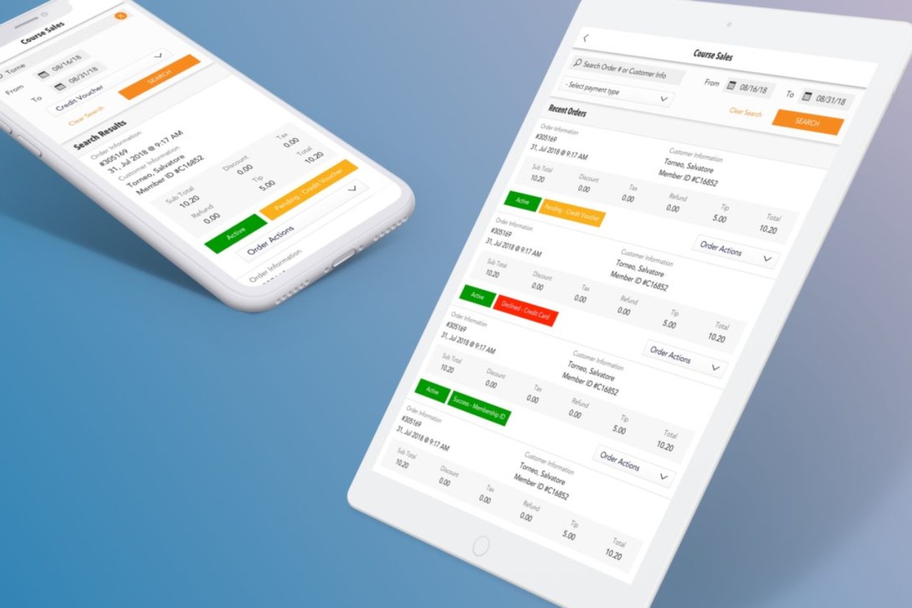
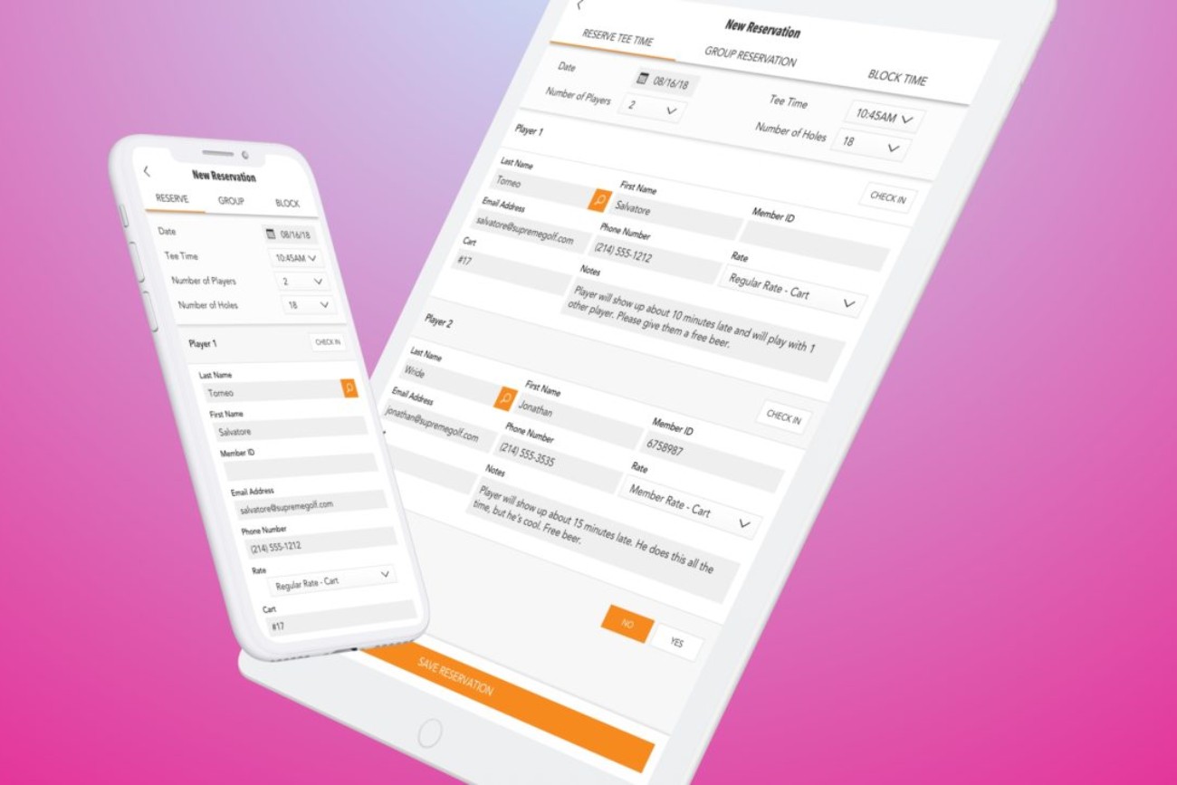
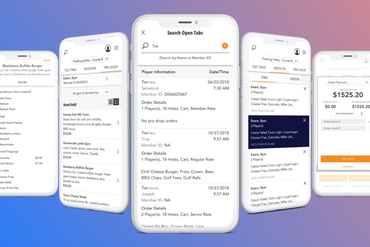
Supreme Golf web-based point-of-sale application.
With the native POS application placed on the back-burner, I had to overcome a completely new challenge.
We needed to build a fully responsive version of the current web-based POS application targeted primarily for tablets that would also work well on mobile devices.
With this new project came a new set of objectives set forth by stakeholders.
“We need this done fast. It ain’t got to look pretty. It just has to work.”
Challenge accepted. Let’s be clear, I can make something simple quickly, but I can also make it look pretty.
Look … an elephant!
In order to get this to market as quickly as possible, we had to forgo the desire to add any new features.
We identified the most basic set of functionality needed to successfully run a course. This reduced the core features set to include tee sheet management, register, services ordering and a sales tracker.
We had to get creative with some the UX workflows to assure the best possible experience on mobile devices.
Guerrilla UX: back in action.
I utilized the same UX/UI team, along with course owners, course employees, and players to discuss the current point-of-sale offerings and to uncover any pain points that could be addressed easily during the planning of this new initiative.
Essentially, we marched forward with most of the UX that was in place in an effort to get to market quicker. Any new ideas were run by the stakeholders and approved as needed.
This was not optimal nor how I would have preferred to approach this, or any project. But like I said before, the real business world can trounce the UX/UI Design process at any given time.
All you can do is lean on your experience, your knowledge of the business and its users and mitigate issues as they arise.
Time to make it beautiful.
Despite the near impossible timeline and other UX/UI obstacles, I was able to create a completely responsive design that was extremely simple to use and easy for the development team to implement using Bootstrap as a framework.
And, in my opinion, it’s simplistic and clean UI made is pretty darn beautiful too.

