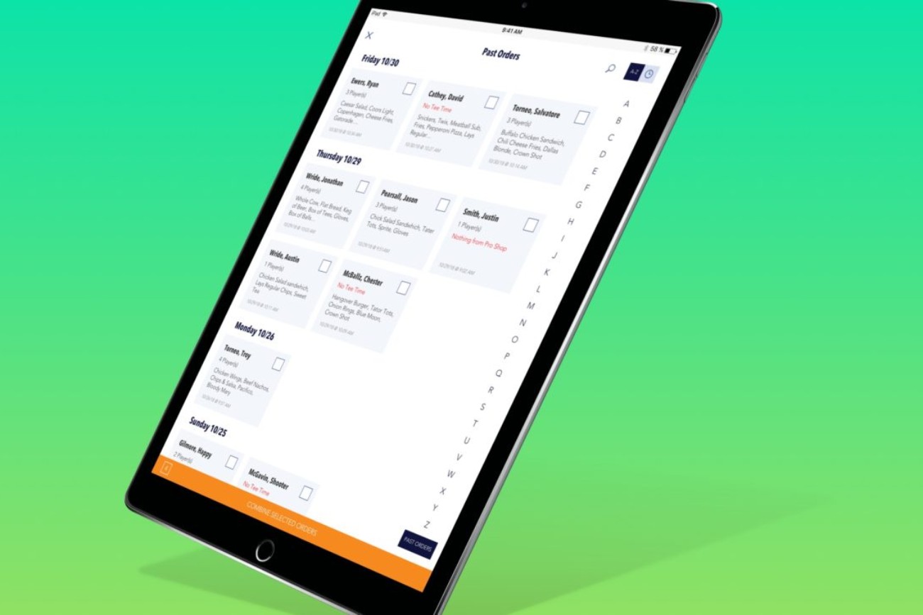
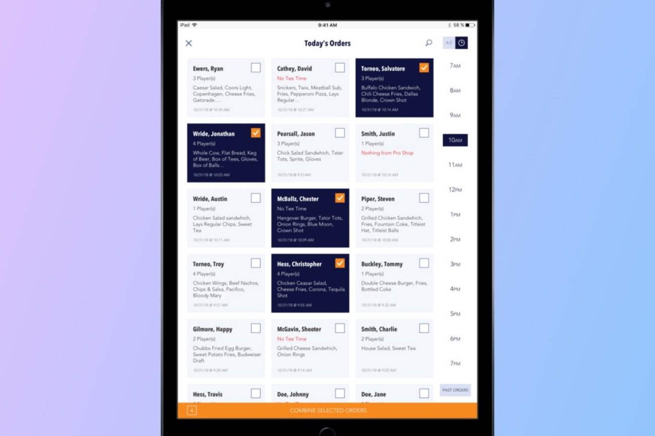
Supreme Golf point-of-sale native application.
This project kicked off like most others.
“Take this laptop. It has a demo of the point-of-sale we just acquired. Figure out how we can rebrand and make it better.”
My strategic, simple and pragmatic approach to UX/UI design always gets the job done. Even when I am thrown on an island and told to “just figure it out”.
Look … an elephant!
We learned that most course owners wanted the ability to run their course from an iPad. Checking in players, assigning carts, taking food orders and accepting payments from anywhere was a course owner nirvana.
Problem #1: The POS was designed to be used solely on a desktop computer, with an HD monitor and in landscape mode. No, it was not built to be responsive.
Problem #2: The POS was web-based making the performance and flexibility not as comparable to a native app. Plus, web-based applications do not benefit from all of the gesture-based inputs that native apps enjoy.
Problem #3: Customer location tracking was possible only through the mobile app.
A new UX process.
Piggybacking off of the Supreme Golf integration UX process, I utilized the same, newly acquired, UX/UI team, along with course owners, course employees, and players to discuss the current point-of-sale offerings and to uncover any pain points.
After user research and some self-evaluating these are some of the top issues I recognized immediately:
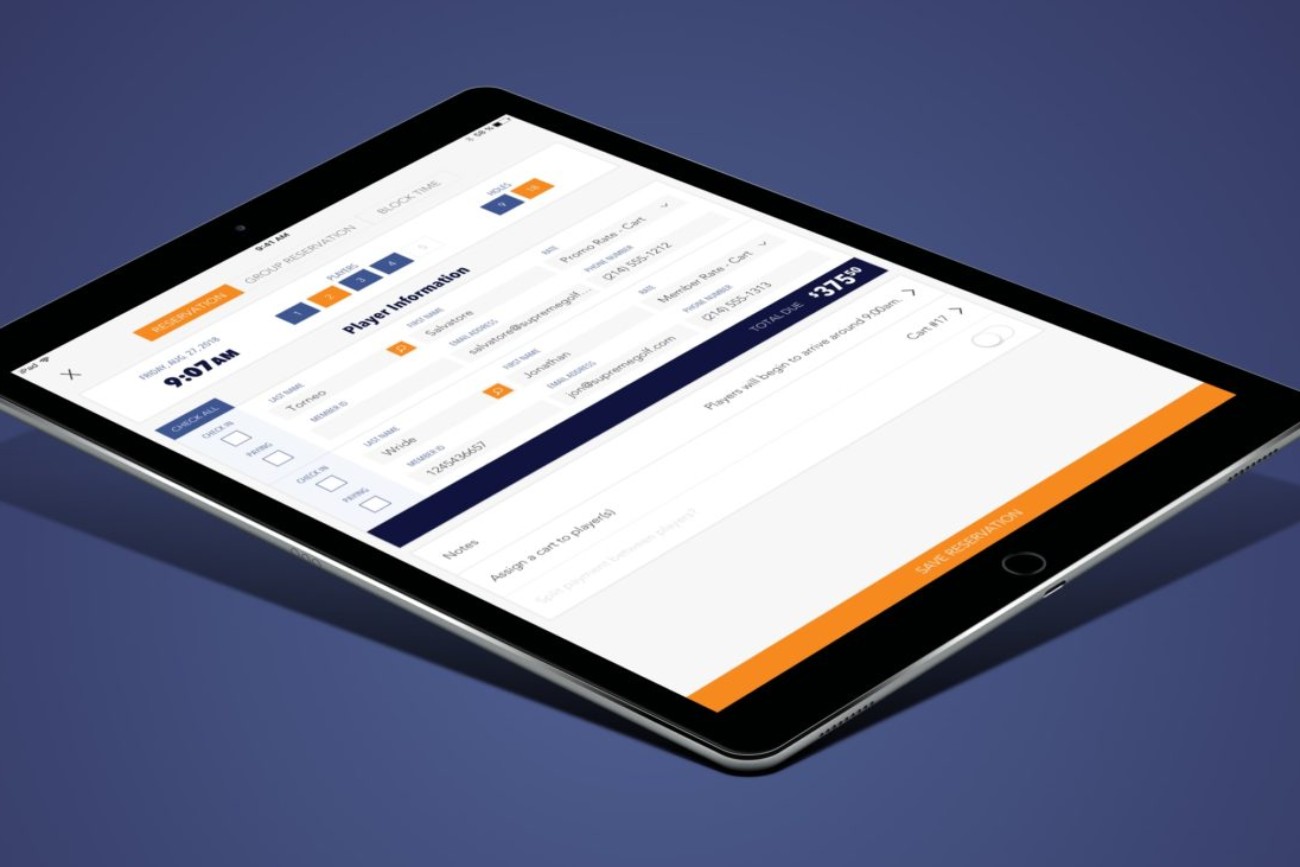
- There was no method to limit the number of players allowed to be entered on a tee time.
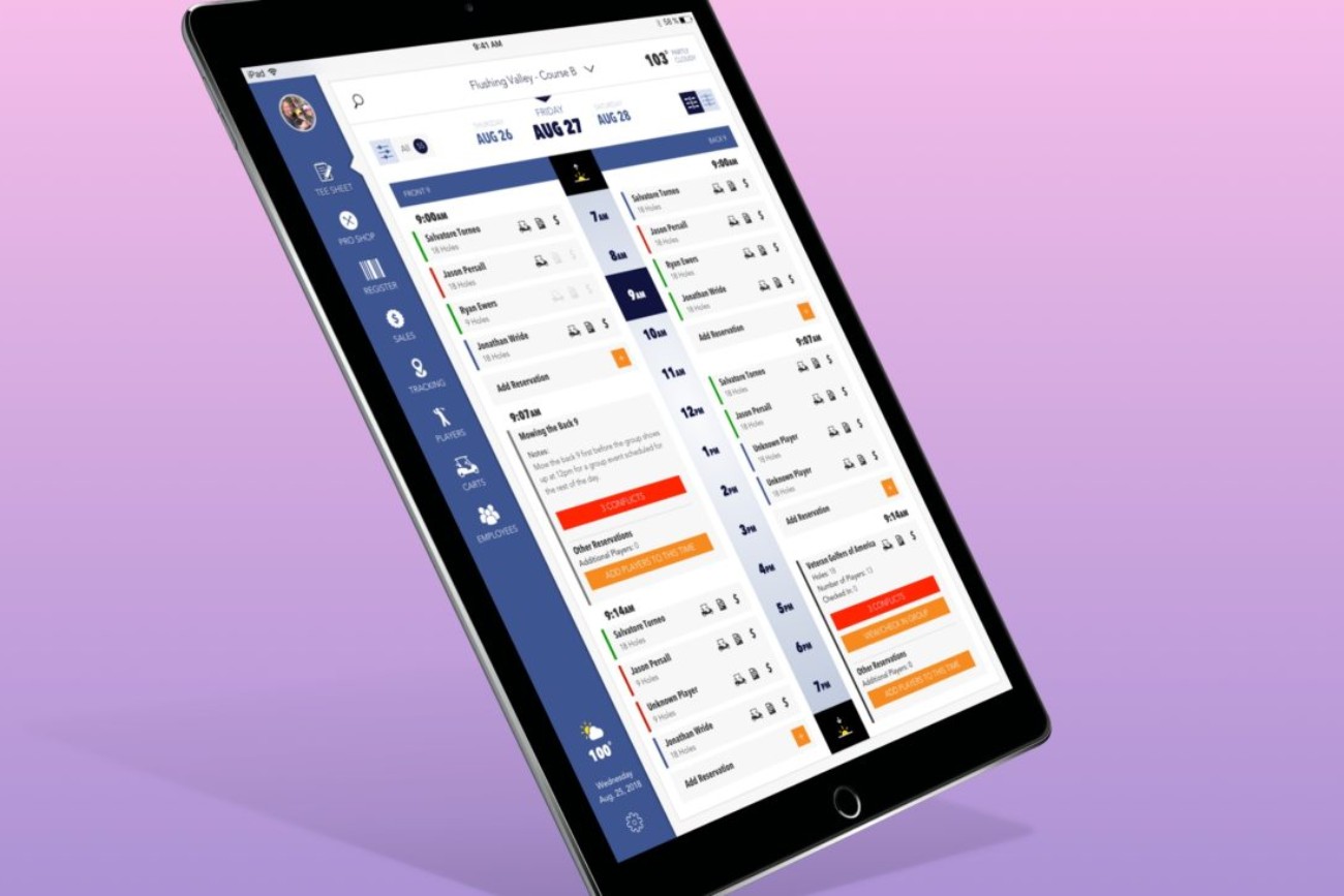
- There was no way to identify or manage conflicting tee times.
- A cart tracking system was needed to fulfill food deliveries.
- We needed a way to manage and assign carts to players.
- Create a visual system to quickly identify a tee time and players status.
- Create a course map view to track the locations of carts.
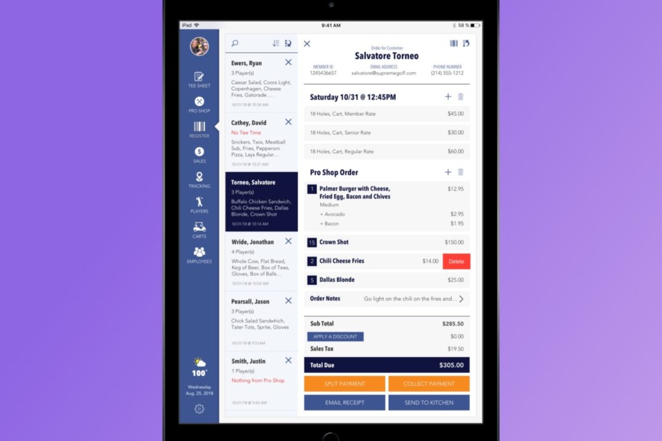
- There was no way to group or split orders.
- Quickly finding opened orders was impossible.
And this is just the tip of the iceberg.
The web-based app worked fairly well inside the pro shop, but it could not adequately fulfill all of the courses needs if it were placed outside of four walls of the pro shop.
Full disclosure: I have never worked with or been a part of creating a POS system in my life!
So, I spent a lot of time researching other point-of-sale systems. I went so far as to ask the bartenders at my local watering hole to show me around their system, share their experiences and workflows, and describe how any other systems they used previously worked differently or better.
I came to the conclusion that most POS systems aren’t very well thought out from a UX-centric perspective and the UI for most of them is horrendous! With the bar set so low I was confident I could do a much better job.
I created a presentation outlining my new holistic course experience idea and pitched it to the executive. It was met with great enthusiasm, but we realized some of the ideas were going to require some time to work out. So we decided to start working on the tee sheet, the services menu and register portions first.
Time to make it beautiful.
From a UI perspective, I wanted the point-of-sale to look-and-feel like it was born from the Supreme Golf B2C family of products. Again, by pulling elements from the design system while creating new components as needed, the UI design process moved forward rather quickly.
Once I had my head wrapped around the tee sheet portion of this project I submitted my UI designs to stakeholders and the development teams. After a few iterations, we were ready to hand off this portion of the point-of-sale to the development team.
Getting the development team on track.
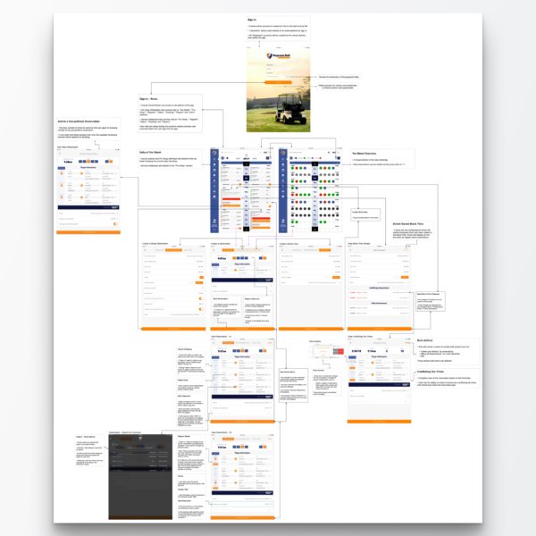
To help the dev team understand the desired user flow I created a workflow map that contained the completed UI designs. This laid out the basic foundation of this portion of the app.
Then there was a change of heart.
The stakeholders later decided that a native app would have taken too long to develop. So they decided to backlog this project and have me begin creating a fully responsive web-based version of the POS app in an effort to get to market quicker.
A new chapter begins.


