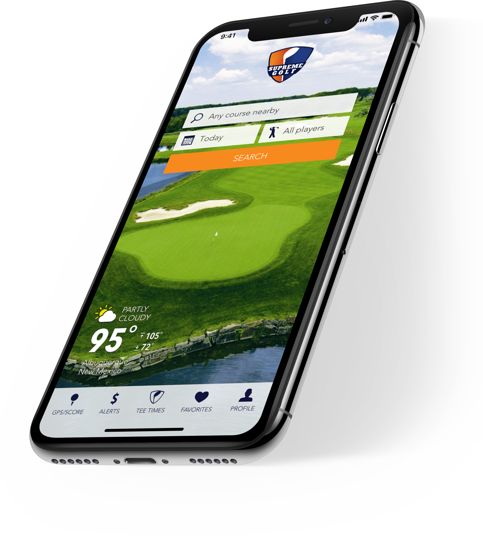
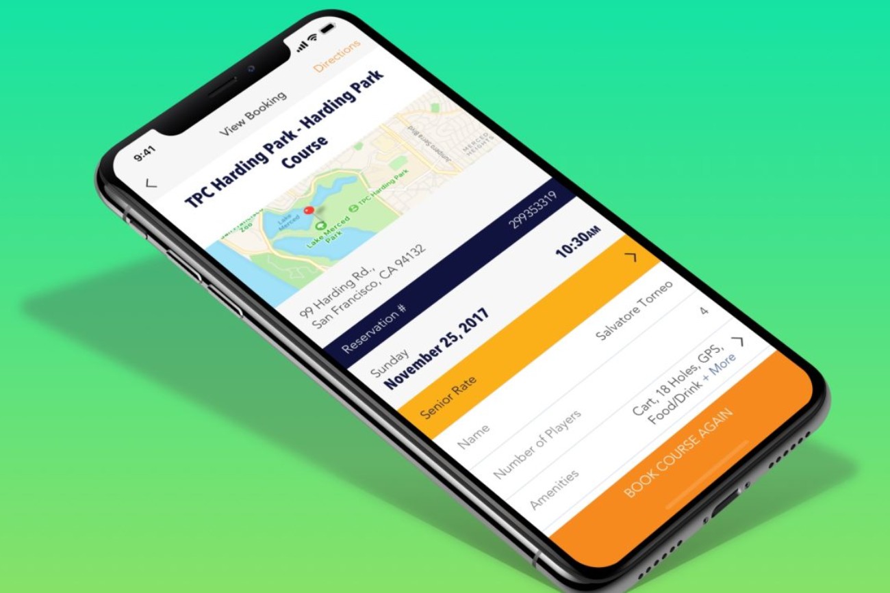
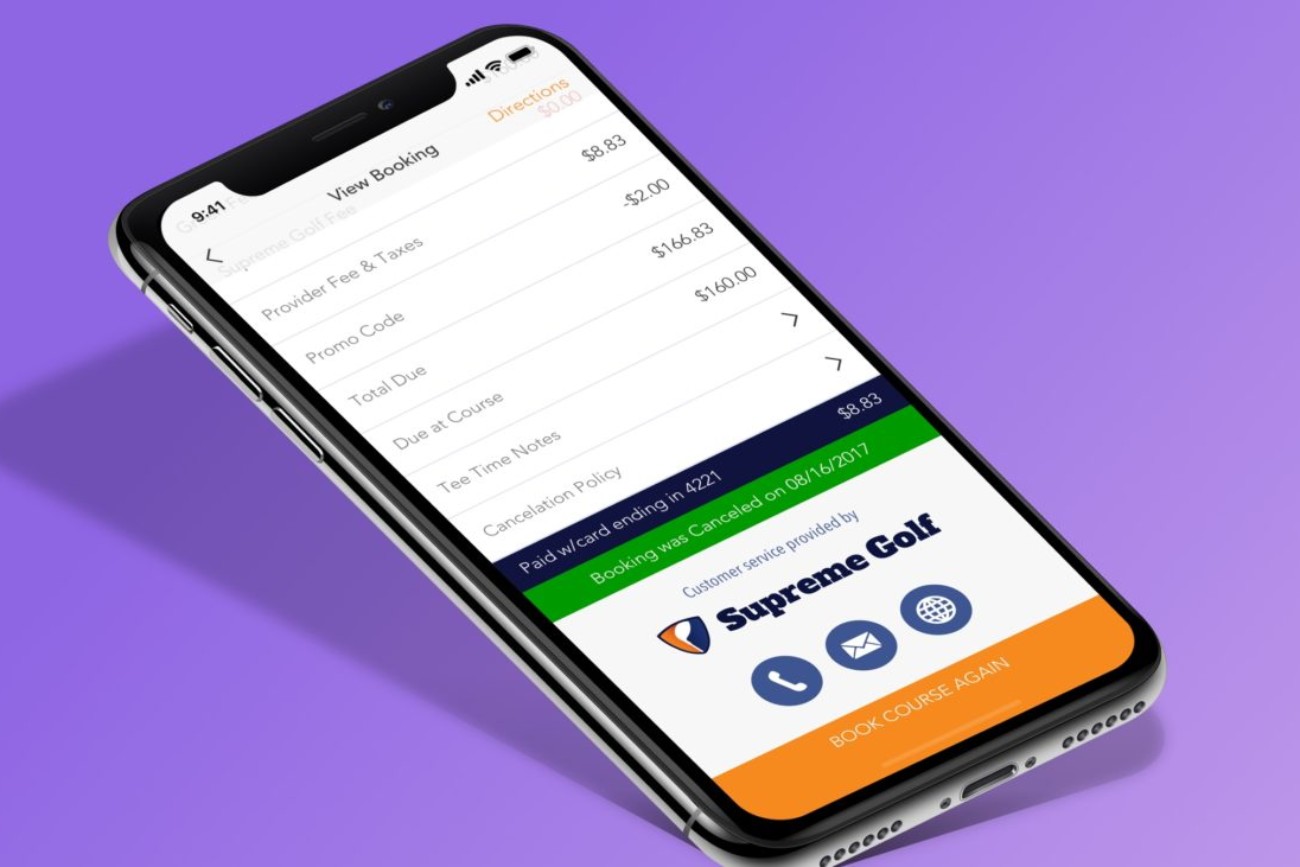
Supreme Golf native application redesign.
Supreme Golf is an aggregator of online tee times. When I joined the company as the Chief Creative Officer, they launched their users directly to the provider’s website to book tee times. We later became the Merchant-of-Record for all tee time providers which changed the game.
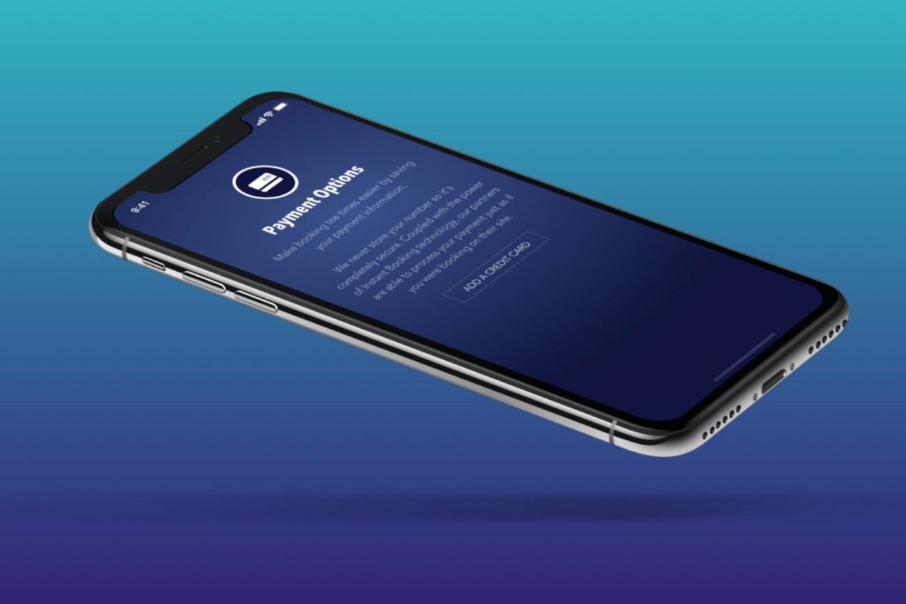
This new model required me to rethink everything from the onboarding to the booking process.
I created and introduced these new workflows into the previous app design while simultaneously creating the new app designs. Inevitably, the requirements and workflows expanded requiring me to enhance them further before introducing them into the new app designs.
Look … an elephant!
There was a massive UX/UI disconnect between the native apps themselves (iOS and Android) and the website. This made the user experience very different on a product-to-product basis.
In order to rein in these issues, I outlined and pitched a holistic vision and execution plan to the executive and development teams.
Guerrilla UX in action.
The executive team wanted this done yesterday.
There was zero time or desire to proceed with a time-consuming UX design process. The timeline and budget demanded quick and decisive actions while delivering effective results.
Although the brand was established and most of the user workflows for the missing functional pieces were in place we had an opportunity, and duty, to expand and improve upon them from a user-centric perspective. I gathered external user feedback, outlined specific “wish-list” items with stakeholders and met with the development team to review pain points associated with our current processes.
After gathering all of this information and performing a competitive analysis, I started sketching out ideas, creating new user workflows and updating brand guidelines to reflect the new direction of the applications.
Wireframes are born from research & sketches.
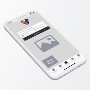
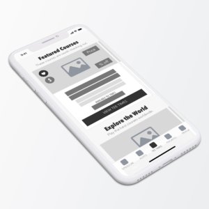
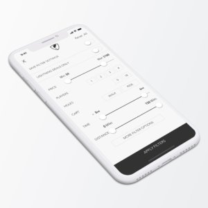
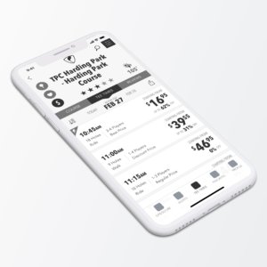
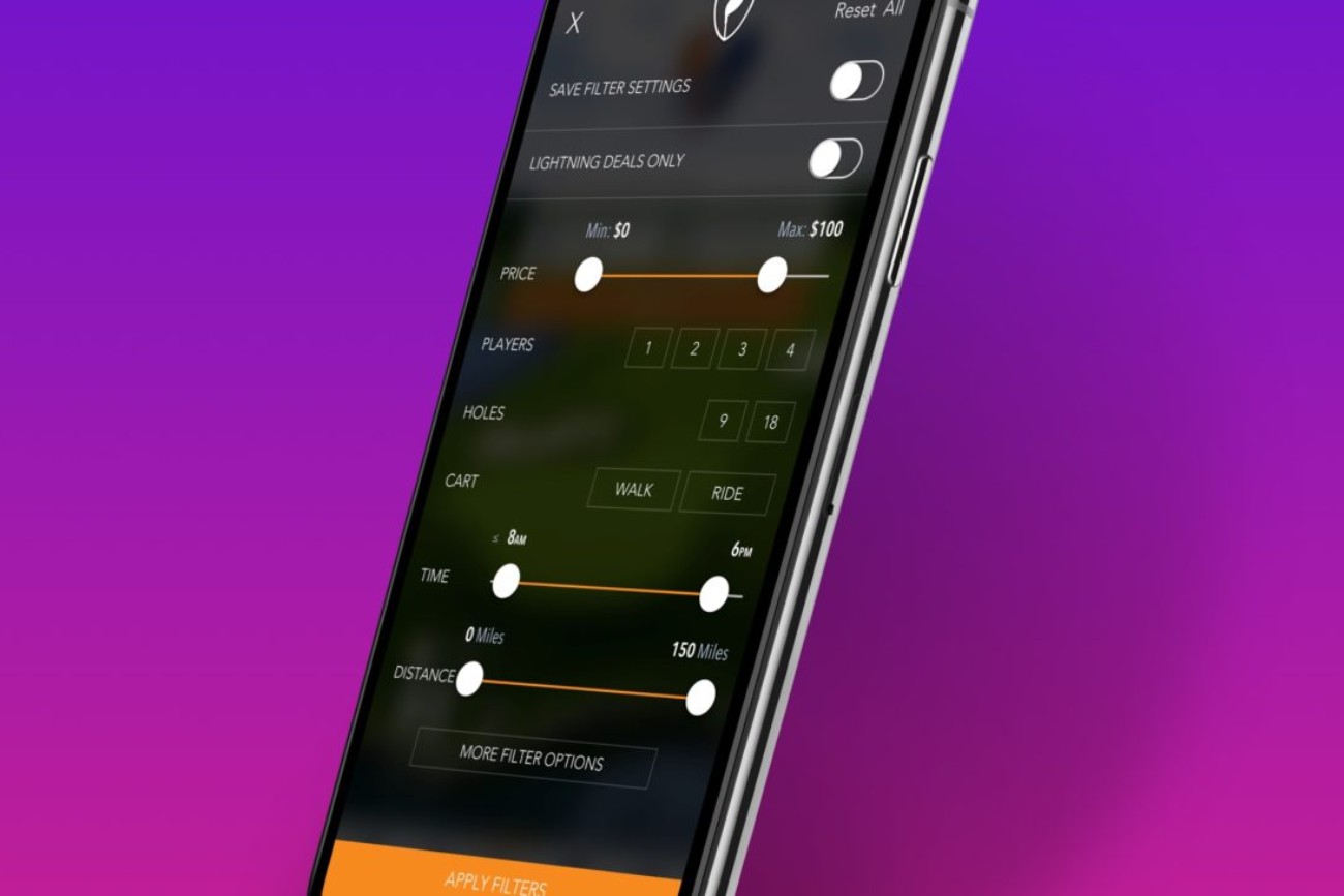
I created wireframes for the core application screens in an effort to showcase my ideas and to effectively gain consensus from stakeholders and team members on the proposed new user workflows.
Since I was also the Lead UI Designer my wireframes have a Hi-Fi quality to them because I think about the UI design during all stages of the UX process.
Prototypes were created when workflows were a bit more complex to offer clarity. This enabled stakeholders to get a better feel for these workflows while giving the development teams some insight into the new user experiences and the opportunity to voice any potential back-end concerns.
Time to make it beautiful.
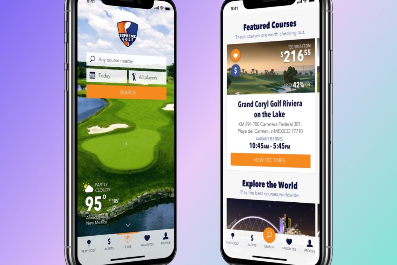
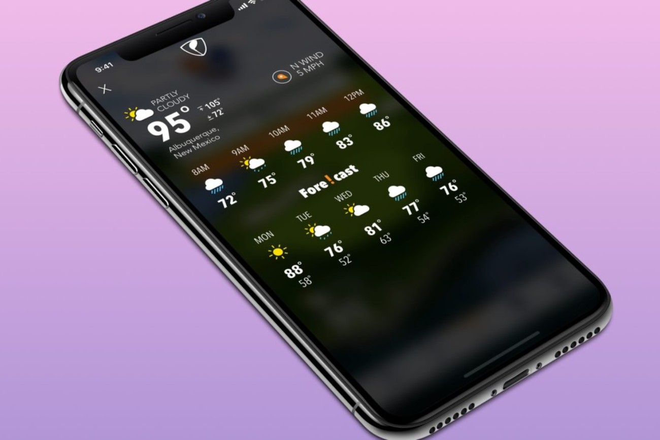
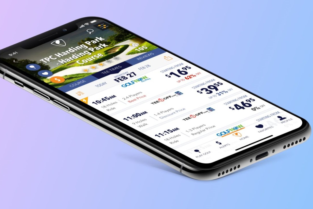
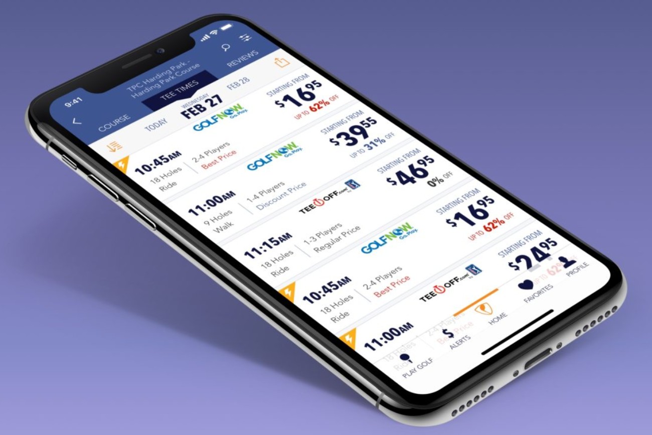
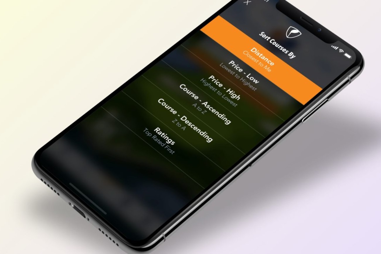
I approached the UI design process with the product launch deadline and the development team in mind by designing the screens the user would see first then working my way forward through the core user workflow. As the development team worked on those screens I branched off to design the less commonly used screens.
Throughout the UI design process, I met regularly with stakeholders and team members to review the UI designs and the associated functionality. Ultimately, 95% of my first round designs were met with enthusiasm and were approved immediately. The remaining 5% went through an iteration process and were approved shortly thereafter.

